
Waterfall
2019
Information Design | UI Design | UX Design | Visual Design
3 Months
Prototyping, User Research, User Scenarios, Wireframes
Collaborating Departments: Data Science, Development, Project Management
Final Designs


Background
Government entities need to understand impacts to critical infrastructures should a hazard occur (man-made or natural event). These infrastructures include: electric power, water treatment plants, nuclear generation plants, hospitals, and much more. The difficulty is understanding the dependencies and resources that flow from one facility to another, and even more difficult to see the impact of resources being distributed from a compromised facility in the system.
Currently, the client has developed an alpha version of Waterfall with limited functionality and scattered information architecture. My goal is to understand the capabilities of Waterfall Alpha and redesign the information architecture and visual style of the tool to successfully communicate impacts on critical infrastructure dependencies.
Design Process

Current Information Architecture
Waterfall Alpha has separate navigation for similar components, which makes the tool unintuitive when switching between screens. Also, both map and graph view which are two main functions of Waterfall, have the same information architecture on the sidebar but components that are not applicable on graph view vs map view.


Heuristic Review
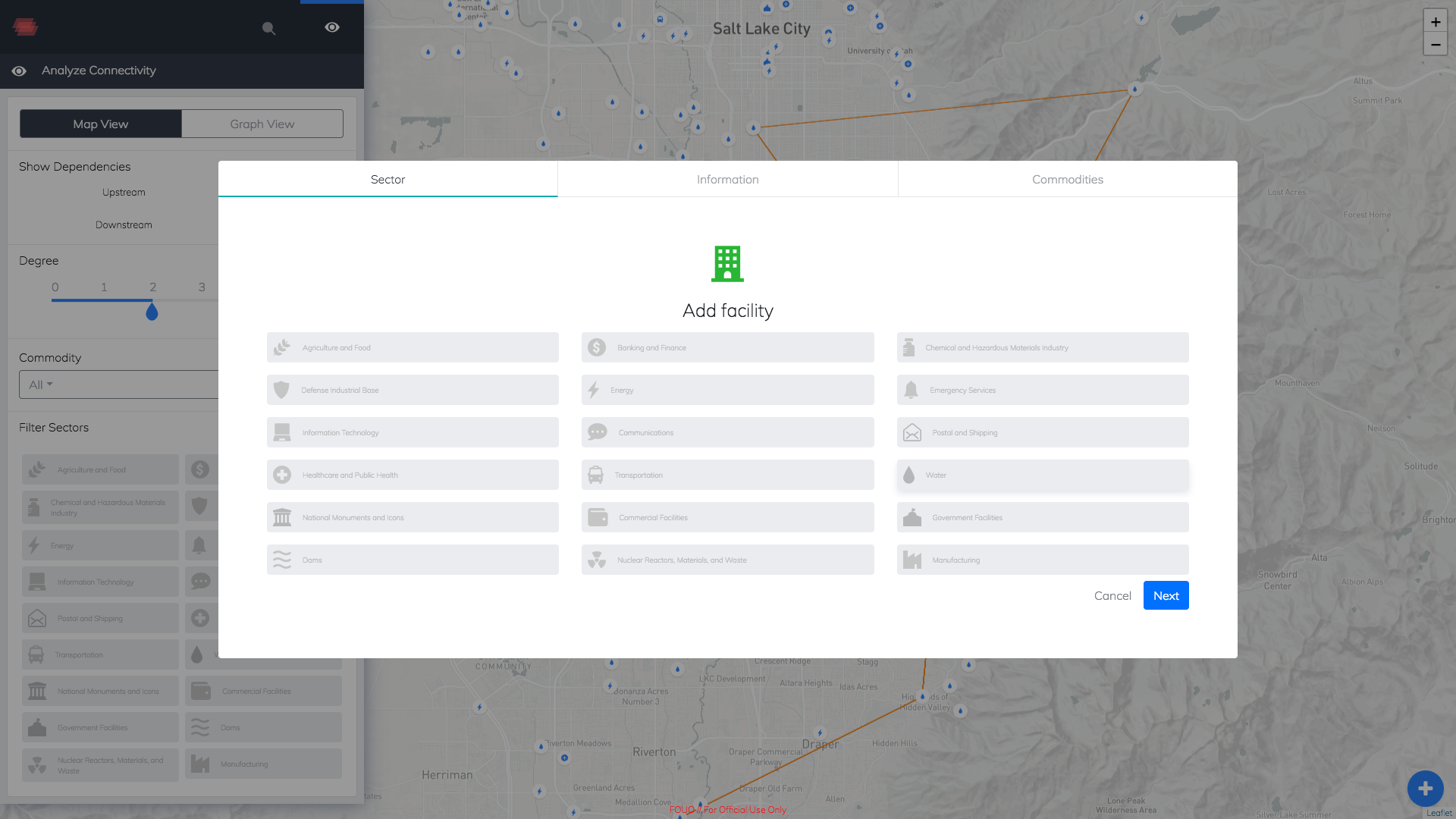
Looking at several components of Waterfall Alpha, I noticed inconsistencies within the navigation and usage of filter selections. For example, the Nav Bar in the first image shows a dropdown filter for “Commodity Selection,” which has multiple options to choose from. And “Filter Sectors” also has similar multiple options to choose from but is treated using icon filters versus dropdowns. These separate functions have the same use cases which makes a confusing user flow.


Current User Flow
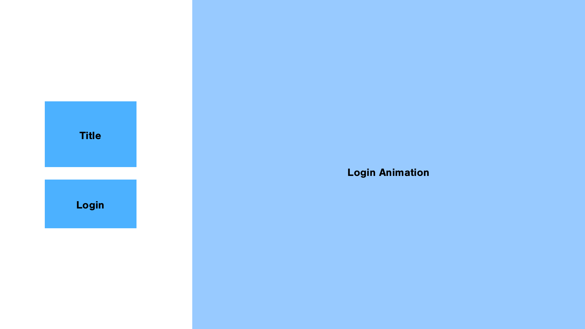
The current user flow starts at the login page and then leads to the map view. Within the map view, the user can navigate towards all other views, which are mostly additions to the map view, and already live within that page. One of the problems is that there is no database of the facilities, their dependencies, and the types of facilities available. The current flow allows the user to navigate the map and search for specific nodes, but doesn’t allow for detailed views of these nodes or more information in the back-end.
User Discovery Session
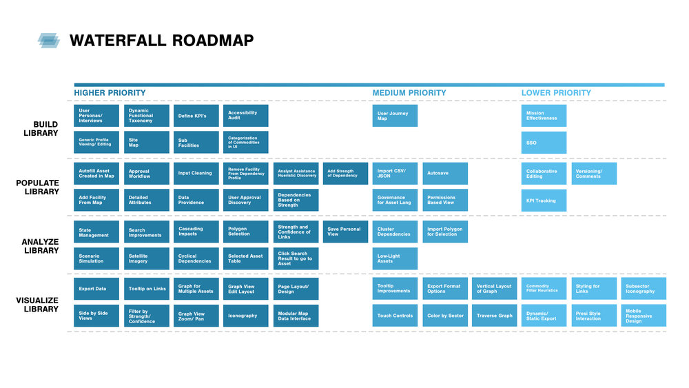
During our discovery session with the client developers, we card sorted a roadmap of tool features that ranged from low-high priority. Included in the road map are both design and development deliverables. This session gave us more insight into the wants of needs of our stakeholders, who were analysts, GIS map experts, and infrastructure planners.


Stakeholder Insights
We conducted several interviews with our clientele, which consisted of GIS Map experts and infrastructure dependency analysts. During these sessions, we walked through Waterfall Alpha and deconstructed the wants and needs of the user, and trucked through different user scenarios that would occur in generic dependency analysis.
With this, we discovered a few pain points:
There is a lack of specific information provided about infrastructure facilities and the actual connections they have with other facilities.
Users spend too much time searching for a facility to focus on.
There is a disconnect between generic facility information and custom information
““Users spend more time looking and playing around with the map than actually utilizing the information shown””
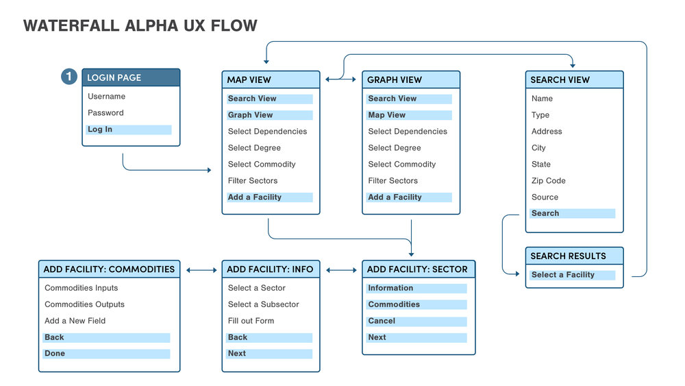
Revised User Flow
With the insights and pain points in mind, I created a revised user flow that creates a simple approach for Waterfall. We start with the “Login Page” which directly leads the user to the “Map View.” And within this view, the user has ownership over many different functions including map filters, the key, and a side-by-side graph view. The user can then stay on the map view, or redirect their attention towards the two other views “Facility List” and “Facility Type List.” “Facility List” has a table of all the facilities within the “Map View” and the user can navigate to a fro from either views. The same goes with “Facility Type List” as the user has the option to view a nested list of facility types or can go back and forth from the other views. Lastly, “Detailed View” tackles the pain point of not being able to retrieve more information about facilities. It is found in the “Facility List” view as a child element to the table. “Detailed View” allows the user to visualize components of the map and generic facilities in a flat view that does not rely on geography. Overall, the revised user flow simplifies the experience and offers more insight into infrastructure facility dependencies.

Ideation
I initially sketched digitally to create blue-scale wireframes, playing around with different elements of each view to gain a sense of what spatial methods would give more room to the map, and still leave enough information for the filters.


Revised Information Architecture
Revising the information architecture of Waterfall gave me better perspective on the flow of information being presented in the tool. This allowed to reposition certain elements of each view and to solidify the details of each component, justifying the position, type of information being displayed, and the form it took.


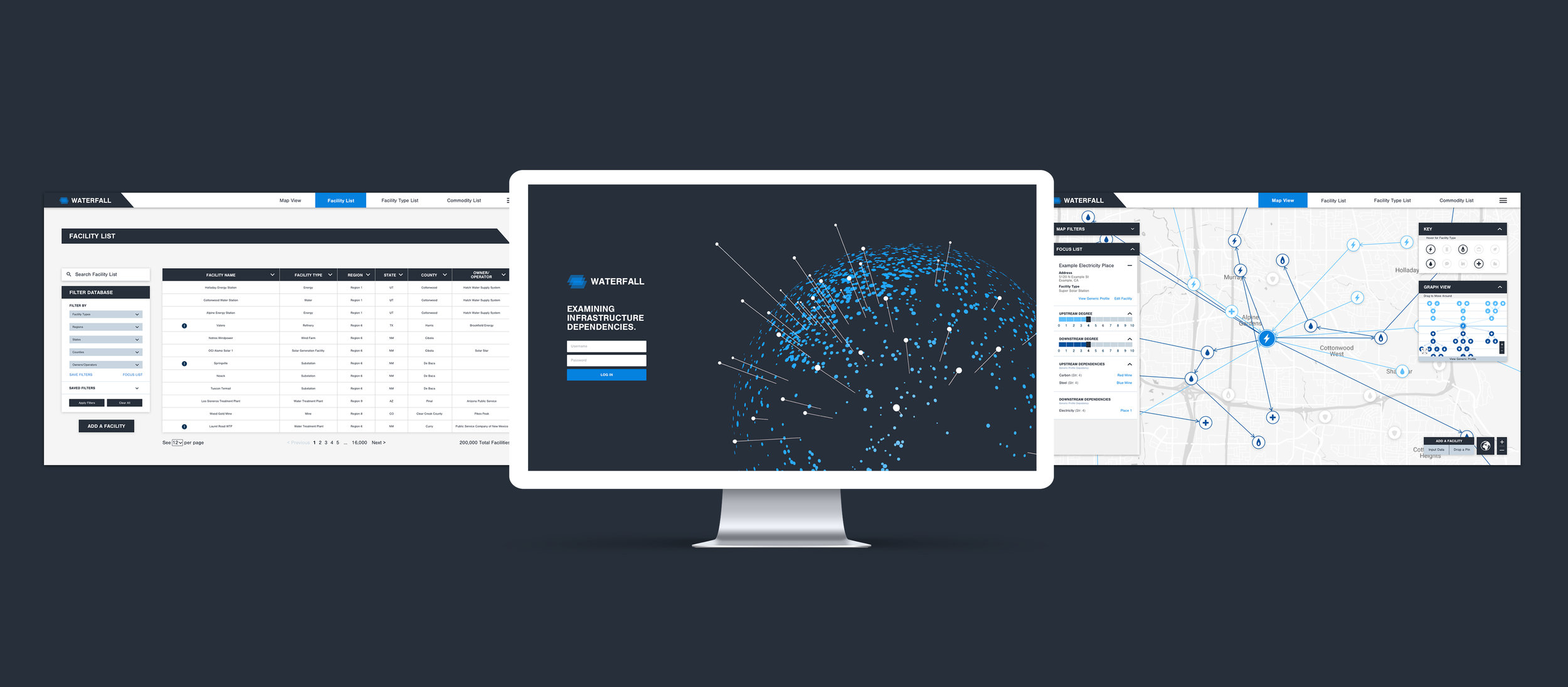
Final Designs
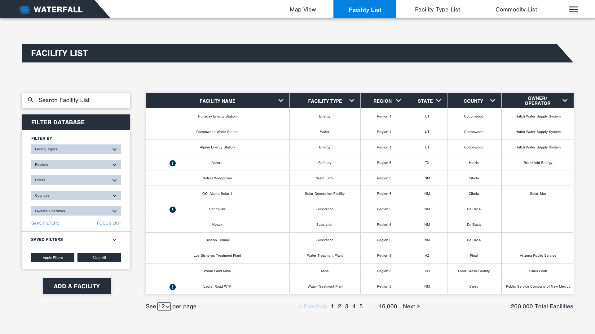
The final designs for Waterfall tackle the pain points from the user discovery session and the inconsistent features from Waterfall Alpha. Map filters and Focus List within “Map View” treat drop-downs and multi-selection dependencies with the same functionality. Also, facility and facility type information across views are the same style and display information consistently. The key in the “Map View” gives transparency to the facility types and what is currently being highlighted. And both “Facility List” and “Facility Type List” carry facility dependencies, the strength of these dependencies, and the facility it corresponds to. Overall, the final designs of Waterfall give users the ability to navigate between a geographic representation of facilities and dependencies and a database representation of the details and properties for those facilities.


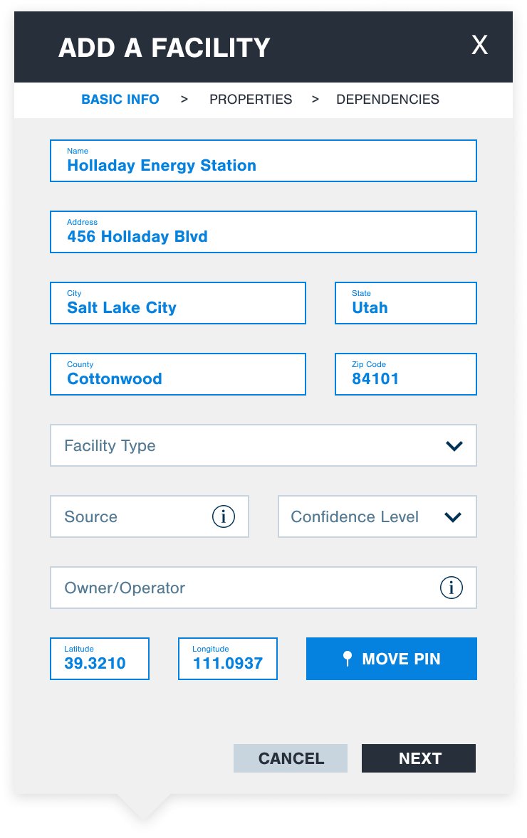
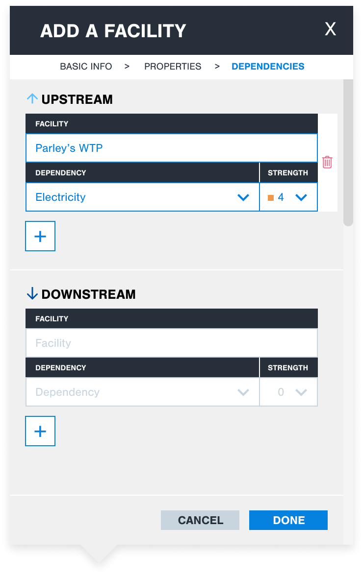
Adding a Facility
Adding a facility consists of three steps organized through a breadcrumb. Treatment on “Properties” and “Dependencies” are very similar, containing tables with drop-downs and fill-in lines. Users are required to navigate in a specific order because certain selections are affected based on a previous selection. Ex: Certain dependencies are available based on the facility chosen.


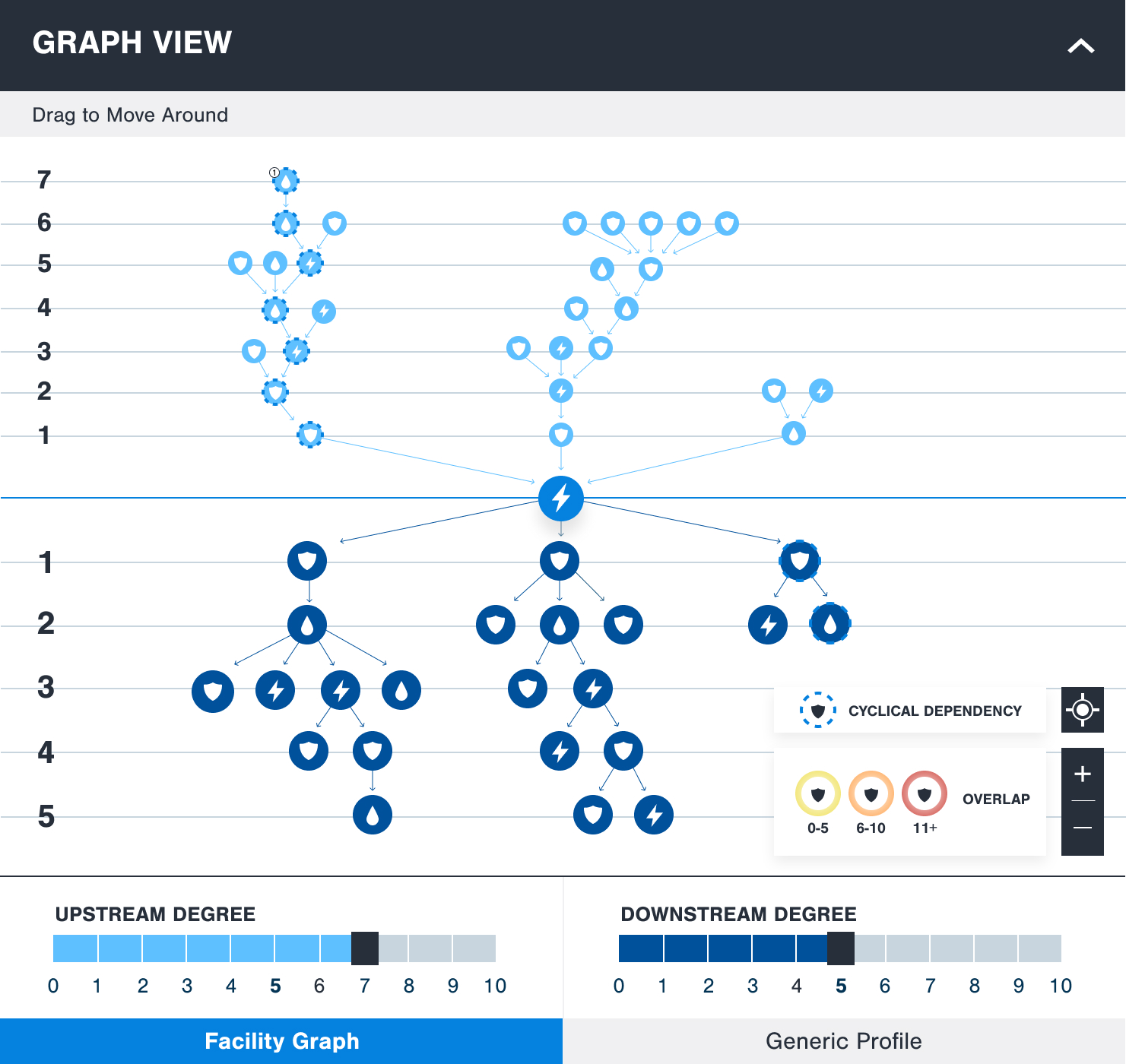
Graph View
This is a 2D representation of the facilities and dependencies that are connected to a selected facility. The relationships are shown based on upstream and downstream degrees up to 10 degrees and show both overlapping facilities and facility family trees that have cyclical dependencies.


Visual Style Guide
For the UI Design, I created a style guide based on several images that captured the mood and vibe of Waterfall: A tool that is sophisticated, complex, and polished. I chose a color palette of various hues of blue and dark grays and whites to compliment the sleek look of the tool, but also to ease the visuals on the eyes since most functions result in large groupings of nodes in a small space.


Evaluation and Future States
Currently, this tool is being developed as an MVP (Minimum viable product) and will resume phase 2 in the near future. Phase 2 includes components such as “Commodity View” which was shown in the wireframes above, but not built out in terms of functionality. After phase 2, we will begin user testing of Waterfall and have many feedback loops to iterate on design flaws and challenges.