

Xbox One Interface Redesign
Improving Xbox’s main console interfaces to maximize
game efficiency and minimize dead end user flows.
Team
Self-Led
Role
UX Designer
Timeline
May 2019 - June 2019
Project Background
The Original Interface
Since 2005, Microsoft has been introducing user interface changes to the Xbox console. Some became iconic, while others left users questioning their design.

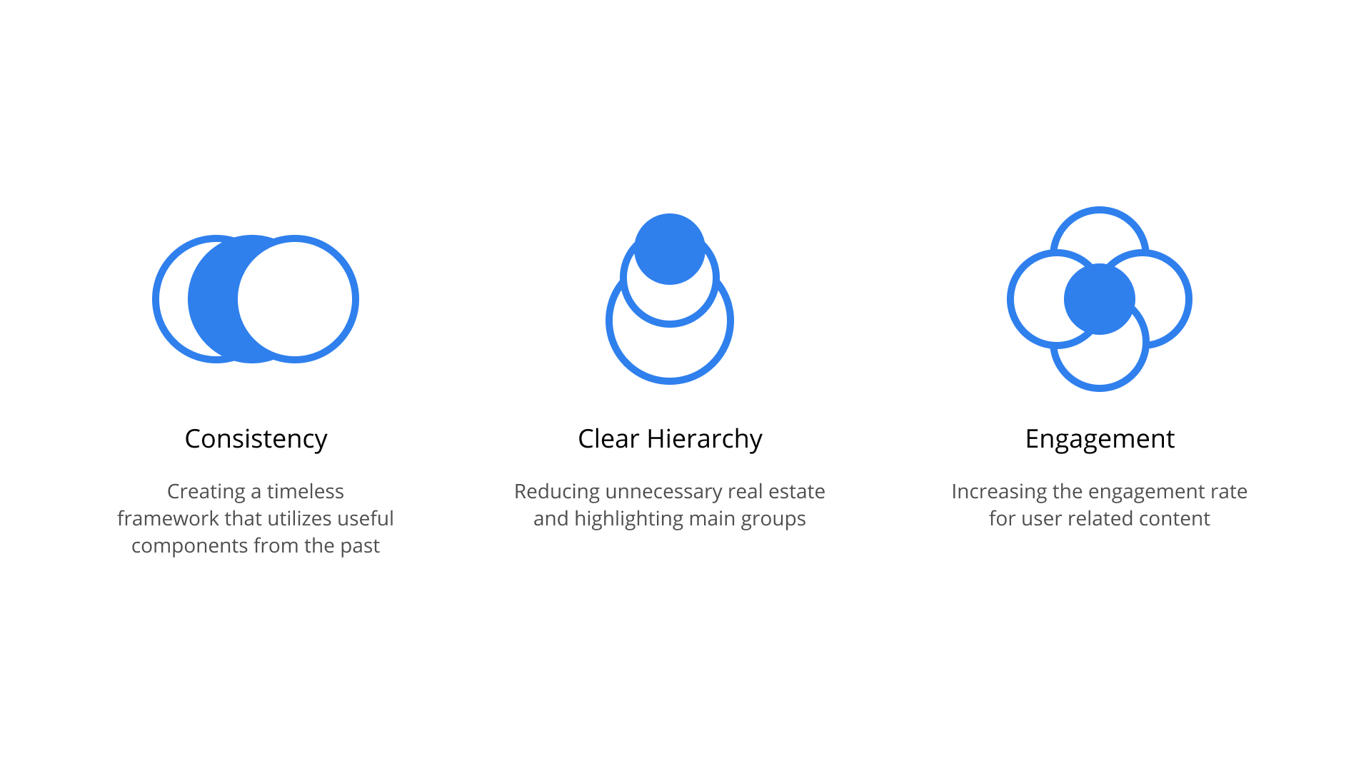
Design Principles
Consistency, clear hierarchy, and engagement rate
These design principles are accompanied by three main steps in my process: User research, ideation, and implementation. Throughout this project, we revisit these key principles which guide the research and ideation.
User Research
Primary and secondary research
Through online forums and blogs such as Reddit and my own primary research with the target audience, I was able to identify key pain points in the interface: Complicated flows within the interfaces, wasted real estate, and limited customization.
False promises about advertisements
““The design isn’t for me and seems like a step back from the last iteration which was quite intuitive.””
Reddit thread about critiques
““The top ⅓ of the screen is now taken up by giant white text of the last used game or app. The entire rest of that area is just blank. No info, no game art, nothing. Just empty space with white text in the middle.””
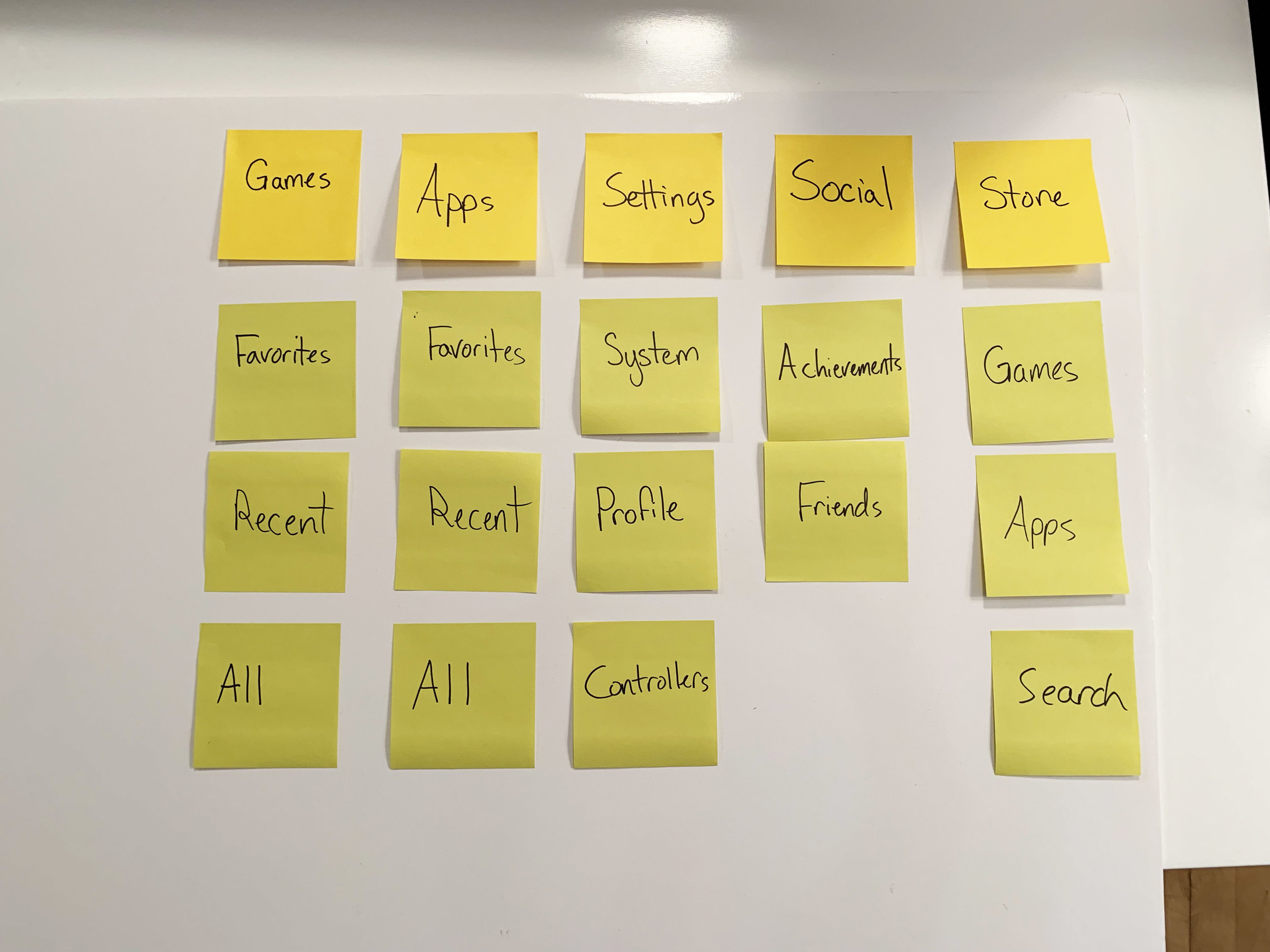
User Testing
Timed trials and card sorting
I conducted time trials on two proto-personas: Calvary (23 years old), “Experienced User” and Mason (27 years old), “Expert User.”
Both were asked to complete several common tasks on the Xbox interface to gauge the usability of the screens and the functionality of certain components. They also grouped elements of the screen by order of priority through an open card sort activity.
Timed trial activity


Timed trial results
Compiled Card Sort
Information Architecture
Revisiting the flow of information
The main shift for the user interface is giving more real estate to the main actors and utilizing wasted white space to improve the user flow. The existing IA gives more focus to secondary actors such as advertisements or recommended games to drive the user to the Xbox marketplace. The ideal IA focuses on the content the user already has, giving them a seamless experience from start to finish.
Competitive Analysis
Revisiting the flow of information
Aside from the existing research, I looked at other gaming platforms with similar interfaces on the market to see the pros and cons of Microsoft’s competitors. PS4 has a similar interface to the Xbox One, but one significant difference is the single row horizontal scroll that streamlines all recent activity. The Nintendo Switch has a similar row scroll that only functions horizontally, and does not have a vertical scroll that shows more icons. The WiiU has three rows of buttons but limits it to those three, focusing more on the horizontal scroll as well.


Affinity Diagram
Final synthesis of the user research
Based on the user observations, interviews, card sorts, and secondary research, I created an affinity diagram to visualize the pain points in the user interface.
UX Flow
Users start with one out of five home page options (Games, Friends, Apps, Streams, Store) based on their customization choice. The starting screen leads to all four other options and vice-versa. The side navigation on the left includes the profile editor and other settings including wifi and display settings. The settings bar is grounded throughout the interface, accessible within all five home page options. Users are able to edit their custom nav bar through an editor button next to the nav bar.
Implementation
Final Designs

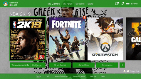
Simple, To the Point
One row horizontal scroll keeps the Xbox One interface intuitive and straight forward. Top navigation for main menus and bottom navigation for important settings.
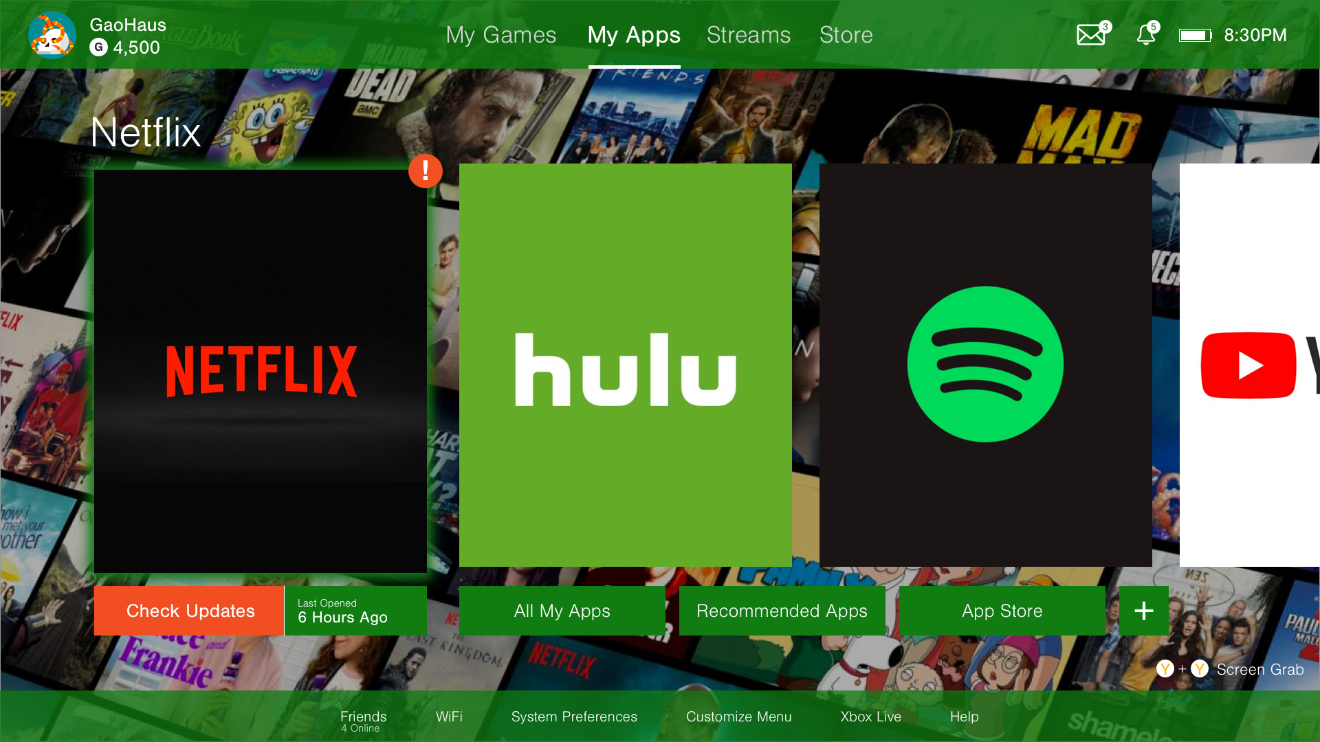
Specific Places for Specific Apps
No more filtering through multiple screens to find Netflix. The top apps are in front of your face, with options to check for updates, browse all apps, or customize the top apps.

Say Bye to Nested Lists
No more are the days of navigating through layers of interactions to just invite a friend to play games. Friends, wifi connection, and other important settings are at your fingertips on the main menu with clear module pop ups.

Watch Streams, not Ads
Experience an immersive dashboard that highlights top live streams from games to IRL content. The space used for advertisements is replaced with useful information about streamers, the categories, and their content.
Prototype Example Flow Comparison

Old Design Friends List
New Design Friends List
User Testing
I took the same 10 users and re-did the timed trial tasks to see if there was an improvement in the speed and functionality of the Xbox interface. All tasks saw an improvement in navigation time, specifically “Accessing Friends List,” which saw a 77% increase in speed and functionality.
New Timed Trial
“77% Faster Accessing Friends List
59.5% Faster Watching Videos/Streams”
Reflection and Next Steps
Overall, the redesign was a success in terms of creating an interface that was more intuitive to both casual and experienced gamers. I saw an increase in usability and functionality within the Xbox One navigation, took advantage of white space with bigger elements and less ads, and brought back old interface elements that were working like the friends list modal.
With more time, the next steps would be to refresh the prototyping using Figma or Invision Studio to create a full experience within the interface so users could see digitally how the different flows are accessed. With the digital prototype, I would re-test the timed trial tasks to see if they match the paper prototype results.